
What people see when they look at your photos
We humans are all made essentially the same way. Aside from any medical conditions present, we all share consistently similar physiology for seeing and for comprehending what we see: eyes and optic system, brain structure and function, cognition, etc.
So when they're presented with a picture, you can be confident that most people's visual systems will respond similarly to:
- Contrast
- Sharpness
- Proportions of size
- Directional indications
- …etc.
As a photographer, you can control the physical experience for a viewer. For each photo you create, you should decide what the viewer will see, and orchestrate the path their eyes will take when looking at the image.
Content is personal
Psychology is where it gets really interesting—two people can see the same thing but feel very differently about it.
When we view any picture, we bring our personal history and experience, memories and biases. This is unavoidable. Most of the subjective response will be driven by the picture content, the actual subject matter. But people can also respond differently to the physical act of seeing, depending on their preferences.
As a result, the response of a viewer is not entirely within our control, but we can design the photo based on what we want it to say, and the feelings it should evoke. It's then up to each viewer to decide whether their responses are personally appealing or not.
The core of photographic design is choosing what you want the viewer to see (and to not see), and determining how they will engage with the photo. This starts by scripting the physical action of looking at the picture.
For review, here are the most essential principles for crafting a successful photograph:
- Set clear priorities and goals for the image
- See accurately what's in the frame
- Compose the picture to lead the viewer's eye around the frame
- …using the elements of design.
Expanding on point #3, following are a few basic steps for deliberately constructing a photo to lead the viewer's eye:
1. Consider the start, the middle, and the end of the viewing experience.
When the viewer is immediately presented with the picture, what is the first thing they should look at? Next… next… and next? Where do they finish? And—if they are actively engaged—begin the process again?
Create a path for the eye to travel along, starting with the physical placement of the visual elements within the frame, and their relationships to one another. For most photos, the optimal path allows the viewer's eye to traverse the frame repeatedly without being drawn outside the photo.
You want your viewer to follow a consistent sequence, while also allowing some freedom and flexibility to explore other areas of interest—all without diminishing the strength of the primary path.
2. One Main Thing
The first thing you want them to see is your most important element in the picture—the main subject and focal point. One of the most powerful techniques in designing a strong photo is to provide a clear and unmissable focal point. If your picture contains two or more elements of similar strength, they compete for attention, weakening them all.
3. Lead the eye
Create a path for eye travel using multiple visual elements. These elements must serve to strengthen the main focal point, rather than distracting from it. When you're designing the photo, pay careful attention to the position, size and relative contrast of all the supporting elements and map the path of eye travel between them.
4. Understand the visual energy and direct it
The path the eye takes will impart a strong influence on the physical experience of viewing the picture, in terms of speed, activity and energy. A smooth, flowing path will generate a calmer, gentler experience, while an angular, jagged path will create higher levels of activity and carry more energy. Your choices here must reflect your intention for the photograph and the meaning, message, and feeling you want to convey to the viewer.
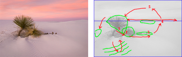
Here's a really simple example—you can do this same kind of markup with your own images to better understand the viewing dynamics:
5. Identify and leverage contrasts
The use of contrast and colour carries strong influence in the path of eye travel. Areas of high contrast are guaranteed to attract the eye, so these need to be identified and dealt with deliberately. This also applies to the presence (or absence) of colour, and the relationships of colour.
Most importantly, if you are drawing the eye a certain direction, be sure it's where you want the eye to go … and provide something useful and interesting there. Otherwise, it becomes only a distraction.
Reminder: One of the most common causes of broken pictures comes down to simply having too much in the frame. Everything competes for the viewer's attention. You must rigorously eliminate anything that clutters or overcomplicates the viewing experience, especially those things that take energy and strength away from the main focal point and your purpose for the photo.
Much of what I've described above relates to the composition of the photograph – the arrangement of elements relative to one another. But other aspects of photography are also involved in the design, such as critical sharpness and depth-of-field, exposure choices, any special effects like motion blur, etc. I'll talk more about these in future lessons.
Ultimately, creating great photographs involves a combination of awareness and intention along with meticulous design. It starts with you seeing clearly and accurately, then making confident decisions based on your priorities for each picture.
The Photocraft Framework comprehensively addresses these principles and techniques, and this is just a small glimpse into all that you’ll learn as a Member of the Photocraft Academy.
Stay connected with news and updates
Join our mailing list to receive the latest news, updates and helpful articles like this one!
We'll never send spam and you can unsubscribe any time.
